Visualising Athlete Change Scores
Use conditional colours to visualise meaningful change in athlete performance tests
In my last post, I covered methods to visualise test battery data and rank a group of athletes based on their scores. Presuming any performance tests are repeated to assess progression and/or regression, this issue of Visualising Athlete Data in R addresses some concepts of reliability and how we may use this data to plot athlete change scores.
Reliability refers to the reproducibility of a measure and is integral to tracking changes in individual athletes1. Performance testing is often done numerous times per year to assess changes in a variety of physical capacities, but there’s almost always some degree of variation that exists between test results whenever an athlete is tested. Therefore, its imperative to establish reliability - typically from repeated trials - to better understand the changes that are meaningful and not simply due to random variation2.
Say we have a squad of 20 athletes who perform a countermovement jump (CMJ) as part of their test battery, and we want to establish the reliability of repeated measures “in-house” to confidently determine when a practically meaningful change in jump height (cm) has occurred. We may take measures on consecutive days during the preseason, for example, where the data - which is simulated for the purpose of this post - may look something like this.
set.seed(20)
athlete <- paste("Athlete", 1:20)
trial_1 <- round(rnorm(20, 42, 2), 1)
trial_2 <- round(trial_1 + runif(20, -2.7, 2.7), 1)
trial_3 <- round(trial_2 + runif(20, -2.7, 2.7), 1)

trials <- data.frame(athlete, trial_1, trial_2, trial_3)
head(trials)
## athlete trial_1 trial_2 trial_3
## 1 Athlete 1 44.3 44.8 44.3
## 2 Athlete 2 40.8 38.3 36.2
## 3 Athlete 3 45.6 45.3 47.7
## 4 Athlete 4 39.3 39.1 36.7
## 5 Athlete 5 41.1 42.5 44.9
## 6 Athlete 6 43.1 42.8 40.3We can establish the typical error (te) that exists from our repeated trials and use this to inform how much we expect our future test scores to vary1. For example, when an athlete is retested, their CMJ result will include a +/- to represent the variability in their score. To calculate the te, the code below first determines the difference from trial to trial and then computes the standard deviation (SD) of the difference scores, the mean of which is divided by the square root of 21.
change_1_to_2 <- trials$trial_2 - trials$trial_1
change_2_to_3 <- trials$trial_3 - trials$trial_2

l <- list(change_1_to_2, change_2_to_3)

te <- round(mean(sapply(l, sd)) / sqrt(2), 1)
te
## [1] 1.1The result is a te of 1.1 cm. We can also report this “error” as a percentage by calculating the coefficient of variation (cv) which may be determined as the between-trial SD (trial_1, trial_2 and trial_3) divided by the between-trial mean, multiplied by 100.
library(matrixStats)

cv <- round(mean((rowSds(as.matrix(trials[, c(2:4)])) /
                 rowMeans(trials[, c(2:4)])) * 100), 1)
cv
## [1] 3I’m using the rowSds() function from matrixStats and rowMeans() above to first determine each individual athlete’s cv before taking the group mean. The result produces a cv of 3% which is pretty low.
We can use the te or cv to assist our interpretation of an athlete’s change score (some examples of how are provided below). However, another useful statistical measure for assessing change from test to test is the smallest worthwhile change (swc)3. Rather than representing the error in a test like the te and cv do, the swc refers to the smallest practically important change in a measure and may be used as a threshold value to determine if a real change in performance has occurred. The swc is determined from reliability data, where a default method for calculation is 0.2 multiplied by the between-subject SD of test scores2,3. I’ve defined this in a custom function (f) below and applied this to the original trials dataset containing our repeated trials.
f <- function(x) { 0.2 * sd(x) }
swc <- round(mean(apply(trials[c(2:4)], 2, f)), 1)
swc
## [1] 0.5Here, we have a swc of 0.5 cm for our simulated data, so an athlete’s next CMJ score would need to at least exceed this threshold before we can confidently conclude there’s been a meaningful performance change from test to retest.
Now that we have conducted a reliability analysis, we can use the data to assess performance changes and plot this in R. The following provides some examples of how to visualise change in ggplot from our CMJ example and use conditional colours that reflect whether there’s been an improvement, decrement or no change in performance.
Plotting
For the purpose of this mock scenario, I’m taking each athlete’s best result (best) from their reliability trials using pmax() and including this in a new data frame alongside the variable retest which represents jump height at, let’s say, the end of pre-season. I’ve set limits of -3 and +4 cm as arguments in runif(), and although these values may seem extreme in terms of reflecting changes in jump height across a pre-season, they’re simply used to illustrate a point in this tutorial.
best <- pmax(trial_1, trial_2, trial_3)

set.seed(40)
retest <- round(best + runif(20, -3, 4), 1)

dat <- data.frame(athlete, best, retest)
The last step in preparing the data for plotting is to calculate each athlete’s change score in raw and percentage units and assign a colour value based on their result. I’m using your typical traffic light system here, where red denotes a decline in performance, green an improvement and orange as stable/unclear. For example:
- If the
changeis -2.3 cm and theteis ±1.1 cm (i.e. -1.2 to -3.4 cm), we can loosely describe the change as a decrease in performance. - If the
changeis 3.7 cm and theteis ±1.1 cm (i.e. 2.6 to 4.8 cm), we can loosely describe the change as an increase in performance. - If the
changeis 0.2 cm and theteis ±1.1 cm (i.e. -0.9 to 1.3 cm), we can refer to this change as stable/unclear due to the lower and upper limits crossing 0.
You’ll note the nested ifelse() functions to conditionally assign one of these three colour values to every data point, where we can use this colour variable as one of our aes() arguments in ggplot to easily represent the colours based on their values. We can also use the reorder() function on athlete to order athletes in the plots based on their change score.
library(tidyverse)

dat <- dat %>%
  mutate(change = retest - best,
         pct_change = round(((best - retest) / best) * -100, 1),
         colour = ifelse(change + te < swc * -1, "darkred",
                         ifelse(change - te > swc, "darkgreen", "orange")),
         athlete = reorder(athlete, change))
head(dat)
## athlete best retest change pct_change colour
## 1 Athlete 1 44.8 46.6 1.8 4.0 darkgreen
## 2 Athlete 2 40.8 43.9 3.1 7.6 darkgreen
## 3 Athlete 3 47.7 49.5 1.8 3.8 darkgreen
## 4 Athlete 4 39.3 37.1 -2.2 -5.6 darkred
## 5 Athlete 5 44.9 43.3 -1.6 -3.6 darkred
## 6 Athlete 6 43.1 43.3 0.2 0.5 orangeNow that our data is prepared for plotting, let’s have a look at some examples that you may consider for visualising change scores.
Example 1
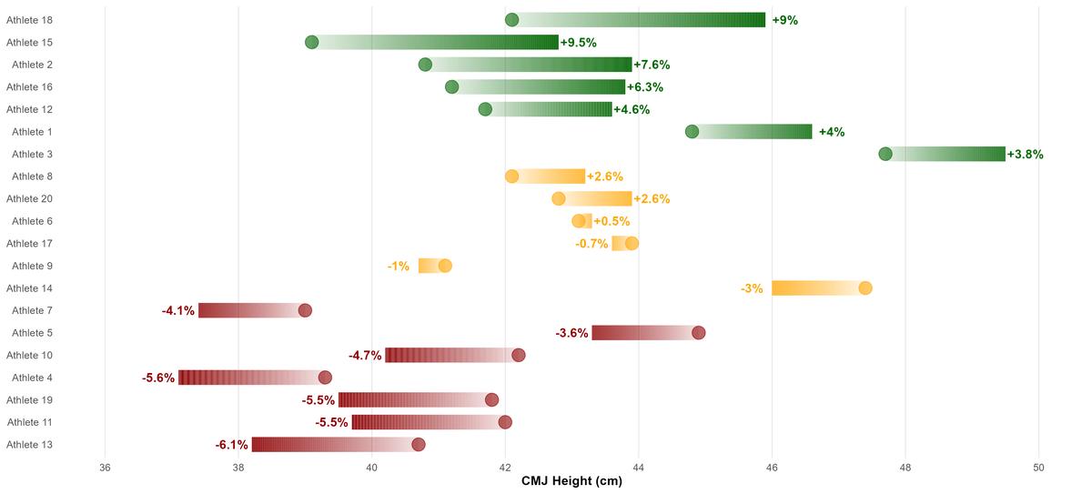
Dumbbell plots are a neat way to visualise change between two data points, such as between test-retest CMJ scores, and this can easily be done with geom_dumbbell() from the ggalt package. However, I’m creating a kind of custom dummbbell plot by adopting an approach I’ve used previously for some of my other analytics work. This requires the ggforce package which I’m simply using as I prefer the way the colours are visualised. Here’s the code.
library(ggforce)

ggplot(dat) +
  geom_link(aes(x = best, xend = retest, y = athlete, yend = athlete,
                colour = colour, alpha = stat(index)),
            show.legend = FALSE, size = 6, n = 500) +
  scale_colour_identity() +
  geom_point(aes(x = best, y = athlete, colour = colour), shape = 19,
             size = 5, alpha = 0.6) +
  scale_x_continuous(limits = c(36, 50),
                     breaks = scales::pretty_breaks(n = 8)) +
  theme_minimal() +
  labs(x = "CMJ Height (cm)") +
  theme(panel.grid.minor.x = element_blank(),
        panel.grid.major.y = element_blank(),
        axis.title.x = element_text(face = "bold"),
        axis.title.y = element_blank()) +
  ### LABELS ###
  geom_text(data = subset(dat, pct_change < cv * -1),
            aes(x = retest, y = athlete, fontface = "bold",
                label = paste0(pct_change, "%")), color = "darkred",
                nudge_x = -0.3) +
  geom_text(data = subset(dat, pct_change > cv),
            aes(x = retest, y = athlete, fontface = "bold",
                label = paste0("+", pct_change, "%")), color = "darkgreen",
            nudge_x = 0.3) +
  geom_text(data = subset(dat, pct_change < 0 & pct_change >= cv * -1),
            aes(x = retest, y = athlete, fontface = "bold",
                label = paste0(round(pct_change, 1), "%")), color = "orange",
            nudge_x = -0.3) +
  geom_text(data = subset(dat, pct_change > 0 & pct_change <= cv),
            aes(x = retest, y = athlete, fontface = "bold",
                label = paste0("+", round(pct_change, 1), "%")),
            color = "orange", nudge_x = 0.3)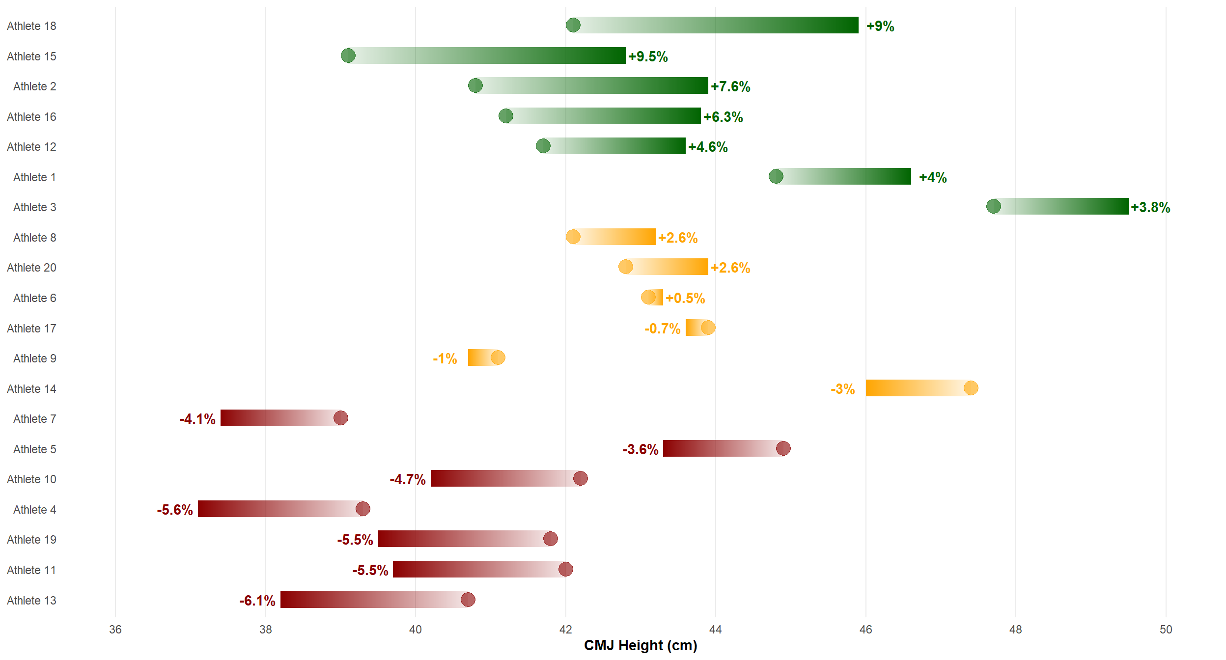
geom_link() connects two data points much like the way geom_dumbbell() does. The points represent each athlete’s baseline CMJ result - their best from the reliability trials - while the end of the link is their retest score. The sequential progression of the colours in the direction of the link (best → retest) is something I personally really like here. The links are based on the raw CMJ values, but I’m reporting the labels in geom_text() as a percentage change.
Example 2
We could also use a similar approach to plot the percentage change (pct_change) from best to retest relative to 0.
ggplot(dat) +
  theme_minimal() +
  geom_rect(aes(x = pct_change, y = athlete), xmin = -3, xmax = 3,
                ymin = as.numeric(dat$athlete[[13]]) - 0.6,
                ymax = as.numeric(dat$athlete[[18]]) + 0.6,
            fill = "#F5F5F5", alpha = 0.1) +
  geom_vline(xintercept = c(-3, 0, 3), linetype = "dashed", size = 0.2) +
  geom_link(aes(x = 0, xend = pct_change, y = athlete, yend = athlete,
                colour = colour, alpha = stat(index)),
            show.legend = FALSE, size = 5, n = 600) +
  scale_colour_identity() +
  scale_x_continuous(limits = c(-8, 10),
                     breaks = scales::pretty_breaks(n = 11)) +
  labs(x = "Percentage Change in Jump Height (%)") +
  theme(panel.grid.minor.x = element_blank(),
        panel.grid.major.y = element_blank(),
        axis.title.x = element_text(face = "bold"),
        axis.title.y = element_blank())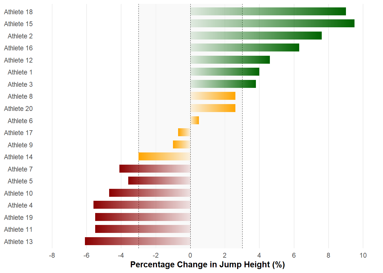
Again, I’m preferring the sequential colours with geom_link() over a traditional horizontal bar plot using geom_col(). We can compare visually our change scores relative to the cv as represented by the shaded area (geom_rect()) and vertical lines (geom_vline()).
Example 3
It may also be useful to plot the swc to visualise the threshold value that represents the smallest important effect when monitoring changes in performance tests. We can use the same approach as the example above by designating the boundaries of the swc with geom_rect() to visualise this threshold and plot points with their respective “uncertainty” (te) using geom_linerange().
ggplot(dat) +
  theme_minimal() +
  geom_rect(aes(x = change, y = athlete), xmin = -0.5, xmax = 0.5,
            ymin = as.numeric(dat$athlete[[13]]) - 0.6,
            ymax = as.numeric(dat$athlete[[18]]) + 0.6,
            fill = "#F5F5F5", alpha = 0.2) +
  geom_vline(xintercept = c(-0.5, 0, 0.5), linetype = "dashed", size = 0.2) +
  geom_linerange(aes(xmin = change - te, xmax = change + te, y = athlete,
                     colour = colour), size = 1.5, alpha = 0.8) +
  scale_colour_identity() +
  geom_point(aes(x = change, y = athlete, fill = colour), shape = 21,
             size = 4) +
  scale_fill_identity() +
  scale_x_continuous(breaks = scales::pretty_breaks(n = 9)) +
  labs(x = "Change in Jump Height (cm)") +
  theme(panel.grid.minor.x = element_blank(),
        panel.grid.major.y = element_blank(),
        axis.title.x = element_text(face = "bold"),
        axis.title.y = element_blank())
We can set the uncertainty for each athlete’s test result by subtracting and adding the te to the raw change score in the xmin = and xmax = arguments, respectively. As you’ll see, those data points crossing the swc are coloured orange to denote a trivial or unclear change in jump height.
Hopefully, these examples have given you some ideas as to how you may visualise change scores for your athletes and lean on fundamental reliability concepts to inform your interpretation. There are many ways to customise these plotting examples further beyond what I’ve highlighted here, so be sure to give these a try using your own data.
1. Hopkins, W.G., Measures of reliability in sports medicine and science. Sports Medicine, 2000. 30(1): p. 1-15.
2. Cormack, S.J., et al., Reliability of measures obtained during single and repeated countermovement jumps. International Journal of Sports Physiology and Performance, 2008. 3(2): p. 131-144.
3. Tofari, P.J., et al., A self-paced intermittent protocol on a non-motorised treadmill: a reliable alternative to assessing team-sport running performance. Journal of Sports Science and Medicine, 2015. 14(1): p. 62-68.