Visualising Athlete GPS Data in R
Create raincloud plots to visualise activity profile distribution
This post is the first in a continuing series for sports scientists showing different methods to visualise athlete data in R. It is important to effectively communicate data to fellow performance staff and coaches to help inform future decision making on athletes, and creating easy to interpret visualisations are useful for this. Working with athlete global positioning system (GPS) data is common for sports scientists, so this first installment shows how to use raincloud plots to visualise the distribution of an athlete’s activity profile. The method described below may also be useful for creating an athlete activity profile “blueprint” that may be used to compare current physical outputs against those typically observed. The plotting method described below uses the ggdist package and has been inspired by work from Cedric Scherer and Bruno Mioto. I encourage you to check out their work for further examples.
I’m using the following packages for this demonstration. Remember to run install.packages() if you haven’t installed these previously.
library(tidyverse)
library(ggdist)
library(ggtext)
library(ggthemes)
library(ggrepel)
library(patchwork)
I’m creating a pretend GPS dataset to use as an example here, but you can import your own using read.csv() or similar. I’ve created three seasons worth of GPS data (20 games per season) which has the cumulative total (tot_dist) and sprint (spr_dist) distances covered from half 1 to half 2 of, let’s say, a soccer match. Here, I’ve added each odd index (half 1) to its even counterpart value (half 2) to calculate the cumulative distance. However, your data may be displayed slightly differently depending on the GPS system you’re using.
set.seed(50)
player <- rep(rep(paste("Player", LETTERS[1:20]), each = 2), times = 60)
season <- rep(c(2019:2021), each = 800)
game <- rep(rep(c(1:20), each = 40), times = 3)
half <- rep(c(1:2), times = 1200)

tot_dist <- rnorm(n = 2400, mean = 5000, sd = 500)
tot_dist[c(FALSE, TRUE)] <- tot_dist[c(FALSE, TRUE)] + tot_dist[c(TRUE, FALSE)]

spr_dist <- rnorm(n = 2400, mean = 300, sd = 50)
spr_dist[c(FALSE, TRUE)] <- spr_dist[c(FALSE, TRUE)] + spr_dist[c(TRUE, FALSE)]

gps <- data.frame(player, season, game, half, tot_dist, spr_dist)
gps$player <- as.factor(gps$player)

gps %>% head(10)
## player season game half tot_dist spr_dist
## 1 Player A 2019 1 1 5274.835 283.6883
## 2 Player A 2019 1 2 9854.033 578.9883
## 3 Player B 2019 1 1 5016.499 316.0543
## 4 Player B 2019 1 2 10278.574 576.3478
## 5 Player C 2019 1 1 4136.198 346.7762
## 6 Player C 2019 1 2 8997.266 657.9435
## 7 Player D 2019 1 1 5180.414 227.4242
## 8 Player D 2019 1 2 9884.958 501.1498
## 9 Player E 2019 1 1 5487.795 295.1264
## 10 Player E 2019 1 2 9764.920 618.6416Next, is some simple data manipulation before we begin plotting for one athlete ("Player A"). I’m creating another variable within this code chunk called jit which is used to create a custom jitter effect for the points in the plot. Finally, I’m extracting the data belonging to the current/most recent match (last_game) which we’ll use to compare against this athlete’s activity profile blueprint.
plot_dat <- gps %>%
  filter(player == "Player A") %>%
  filter(half == 2)

set.seed(200)
plot_dat$jit <- runif(nrow(plot_dat), -0.1, 0.1)

last_game <- plot_dat %>%
  tail(1)

plot_dat <- plot_dat %>%
  head(-1) # Remove last_game from plot_dat.
Plot
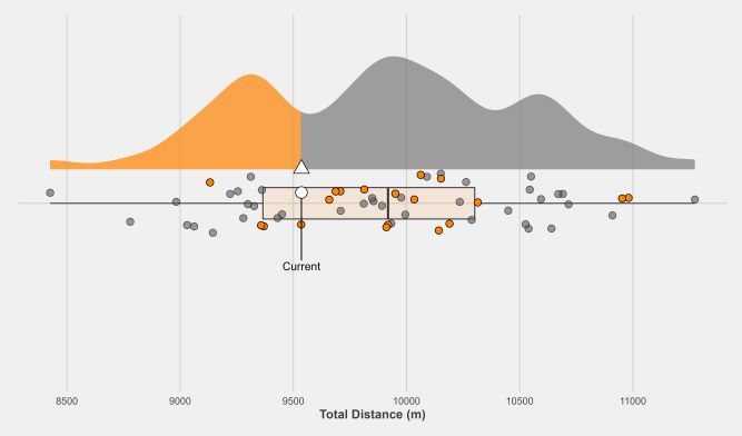
I’m going to first plot the distribution of total distance covered in a match for "Player A" using the ggdist package and some other ggplot2 features. The first lines of code below compute the percentiles of tot_dist which I’m using to apply a custom fill aesthetic to stat_halfeye (similar to work by Bruno Mioto) to show the proportion of total distances covered that are greater or less than the current total distance covered. I’ve set justification = -0.3 to shift the raincloud plot to the right and used .width = 0 and point_colour = NA so I can include my own boxplot next to it (eventually it will be underneath).
pct_td <- quantile(plot_dat$tot_dist,
                   stats::ecdf(plot_dat$tot_dist)(last_game$tot_dist),
                   type = 1)

ggplot(data = plot_dat, aes(x = player, y = tot_dist)) +
  stat_halfeye(aes(fill = stat(y < pct_td)),
               adjust = 0.5,
               width = 0.4,
               .width = 0,
               point_colour = NA,
               justification = -0.3,
               alpha = 0.7) +
  scale_fill_manual(values = c("FALSE" = "gray48",
                               "TRUE" = "#FF8200"))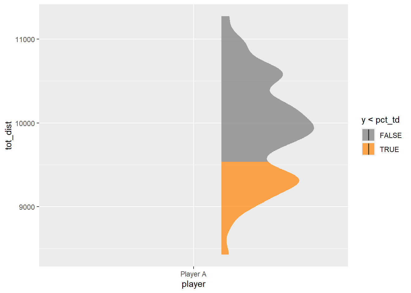
The next step is to add the boxplot using geom_boxplot and then the points representing the total distances covered from each game over the top. Rather than the points being in a straight line, the jit variable created above will add some random variation to each point’s location to aid the readability of the plot. All points are plotted with the first geom_point layer, and then only those belonging to the most recent season (2021) are plotted with a different fill in the second. Note, there’s various ways to achieve this same end result, this is just the method used here.
ggplot(data = plot_dat, aes(x = player, y = tot_dist)) +
  stat_halfeye(aes(fill = stat(y < pct_td)),
               adjust = 0.5,
               width = 0.4,
               .width = 0,
               point_colour = NA,
               justification = -0.3,
               alpha = 0.7) +
  scale_fill_manual(values = c("FALSE" = "gray48",
                               "TRUE" = "#FF8200")) +
  ### CHANGE IS HERE ###
  geom_boxplot(fill = "#FF8200",
               width = 0.1,
               alpha = 0.1,
               outlier.shape = NA) +
  geom_point(aes(x = as.numeric(player)+jit),
             fill = "#58595B",
             colour = "black",
             shape = 21,
             size = 3,
             alpha = 0.6) +
  geom_point(aes(x = as.numeric(player)+jit,
                 y = ifelse(season == max(season), tot_dist, NA)),
             fill = "#FF8200",
             colour = "black",
             shape = 21,
             size = 3)
This plot is beginning to take shape! Before some formatting edits to finish things off, we need to include the data belonging to the current/most recent match (last_game). I’m doing this by adding two more geom_point layers, one for the raincloud plot and another underneath. I’ve set these points larger in size so they stand out a little more for comparison and included a text label to the point in the boxplot.
ggplot(data = plot_dat, aes(x = player, y = tot_dist)) +
  stat_halfeye(aes(fill = stat(y < pct_td)),
               adjust = 0.5,
               width = 0.4,
               .width = 0,
               point_colour = NA,
               justification = -0.3,
               alpha = 0.7) +
  scale_fill_manual(values = c("FALSE" = "gray48",
                               "TRUE" = "#FF8200")) +
  geom_boxplot(fill = "#FF8200",
               width = 0.1,
               alpha = 0.1,
               outlier.shape = NA) +
  geom_point(aes(x = as.numeric(player)+jit),
             fill = "#58595B",
             colour = "black",
             shape = 21,
             size = 3,
             alpha = 0.6) +
  geom_point(aes(x = as.numeric(player)+jit,
                 y = ifelse(season == max(season), tot_dist, NA)),
             fill = "#FF8200",
             colour = "black",
             shape = 21,
             size = 3) +
  ### CHANGE IS HERE ###
  geom_text_repel(data = last_game, aes(x = as.numeric(player)+jit,
                                             label = "Current"),
                    nudge_x = -0.2-last_game$jit) +
  geom_point(data = last_game, aes(x = as.numeric(player)+jit,
                                   y = tot_dist),
             fill = "white",
             colour = "black",
             shape = 21,
             size = 5) +
  geom_point(data = last_game, aes(x = as.numeric(player) + 0.11,
                                   y = tot_dist),
             fill = "white",
             color = "black",
             shape = 24,
             size = 5,
             stat = "unique")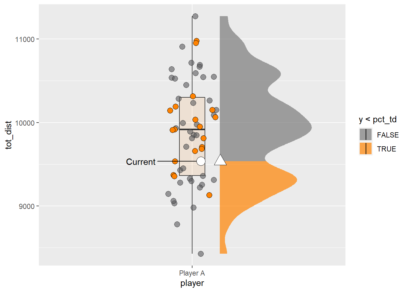
Some final touches to the plot include customising the number of breaks on the y axis, calling coord_flip so the plot is horizontal rather than vertical, adding/removing axis titles/text and editing the plot theme. I’m choosing theme_fivethirtyeight from the ggthemes package as I like its simple look and its one I use often for some of my other analytics work.
p1 <- ggplot(data = plot_dat, aes(x = player, y = tot_dist)) +
  stat_halfeye(aes(fill = stat(y < pct_td)),
               adjust = 0.5,
               width = 0.4,
               .width = 0,
               point_colour = NA,
               justification = -0.3,
               alpha = 0.7) +
  scale_fill_manual(values = c("FALSE" = "gray48",
                               "TRUE" = "#FF8200")) +
  geom_boxplot(fill = "#FF8200",
               width = 0.1,
               alpha = 0.1,
               outlier.shape = NA) +
  geom_point(aes(x = as.numeric(player)+jit),
             fill = "#58595B",
             colour = "black",
             shape = 21,
             size = 3,
             alpha = 0.6) +
  geom_point(aes(x = as.numeric(player)+jit,
                 y = ifelse(season == max(season), tot_dist, NA)),
             fill = "#FF8200",
             colour = "black",
             shape = 21,
             size = 3) +
  geom_text_repel(data = last_game, aes(x = as.numeric(player)+jit,
                                             label = "Current"),
                    nudge_x = -0.2-last_game$jit) +
  geom_point(data = last_game, aes(x = as.numeric(player)+jit,
                                   y = tot_dist),
             fill = "white",
             colour = "black",
             shape = 21,
             size = 5) +
  geom_point(data = last_game, aes(x = as.numeric(player) + 0.11,
                                   y = tot_dist),
             fill = "white",
             color = "black",
             shape = 24,
             size = 5,
             stat = "unique") +
  ### CHANGE IS HERE ###
  scale_y_continuous(breaks = scales::pretty_breaks(n = 6)) +
  coord_flip() +
  theme_fivethirtyeight() +
  labs(y = "Total Distance (m)") +
  theme(legend.position = "none",
        axis.title.x = element_text(face = "bold"),
        axis.title.y = element_blank(),
        axis.text.y = element_blank())

p1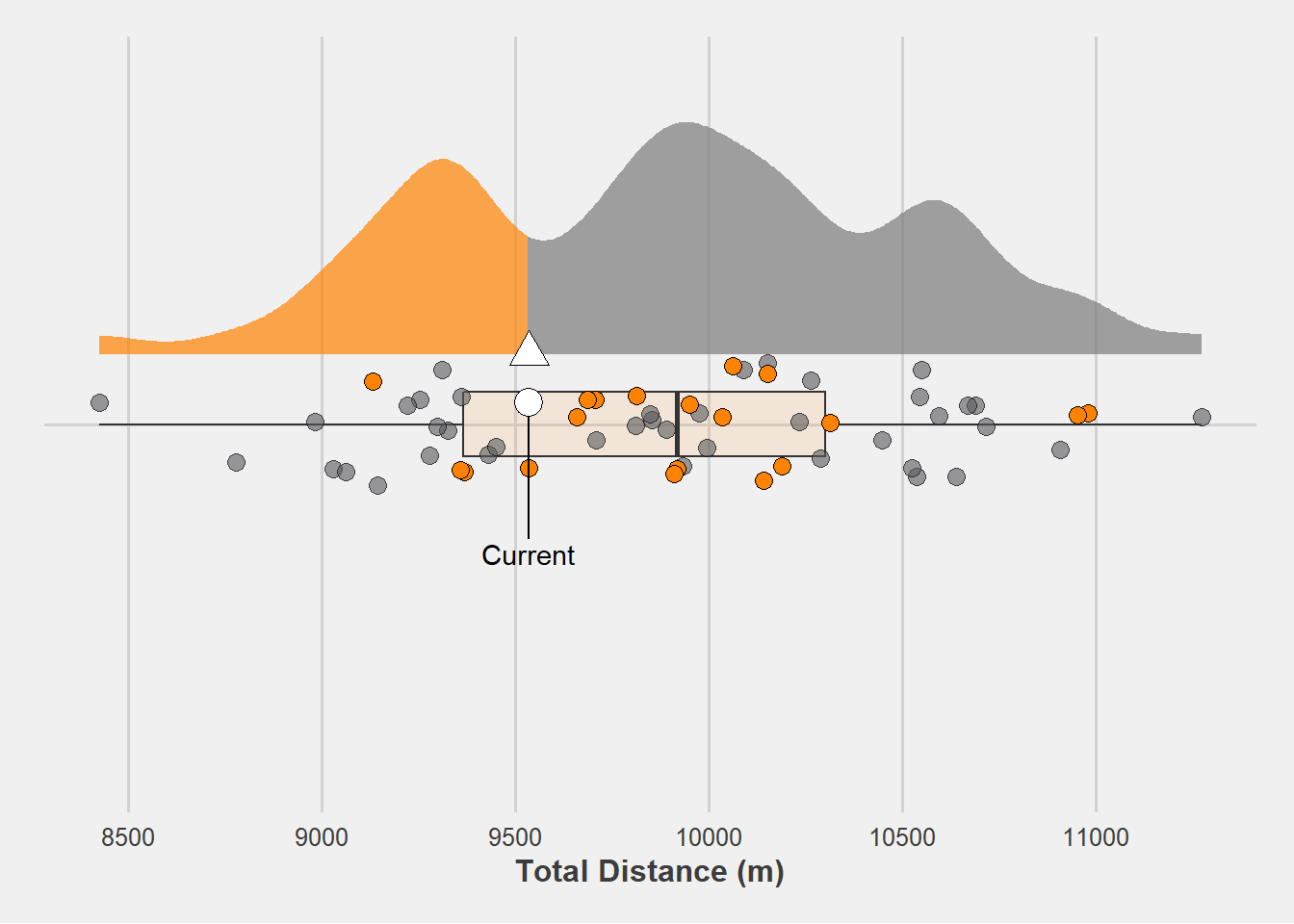
We can, of course, repeat the steps above to plot the distribution of sprint distance (spr_dist) for this athlete.
pct_spr <- quantile(plot_dat$spr_dist,
                       stats::ecdf(plot_dat$spr_dist)(last_game$spr_dist),
                       type = 1)

p2 <- ggplot(data = plot_dat, aes(x = player, y = spr_dist)) +
  stat_halfeye(aes(fill = stat(y < pct_spr)),
               adjust = 0.5,
               width = 0.4,
               .width = 0,
               point_colour = NA,
               justification = -0.3,
               alpha = 0.7) +
  scale_fill_manual(values = c("FALSE" = "gray48",
                               "TRUE" = "#FF8200")) +
  geom_boxplot(fill = "#FF8200",
               width = 0.1,
               alpha = 0.1,
               outlier.shape = NA) +
  geom_point(aes(x = as.numeric(player)+jit),
             fill = "#58595B",
             colour = "black",
             shape = 21,
             size = 3,
             alpha = 0.6) +
  geom_point(aes(x = as.numeric(player)+jit,
                 y = ifelse(season == max(season), spr_dist, NA)),
             fill = "#FF8200",
             colour = "black",
             shape = 21,
             size = 3) +
  geom_text_repel(data = last_game, aes(x = as.numeric(player)+jit,
                                             label = "Current"),
                    nudge_x = -0.2-last_game$jit) +
  geom_point(data = last_game, aes(x = as.numeric(player)+jit,
                                   y = spr_dist),
             fill = "white",
             colour = "black",
             shape = 21,
             size = 5) +
  geom_point(data = last_game, aes(x = as.numeric(player) + 0.11,
                                   y = spr_dist),
             fill = "white",
             color = "black",
             shape = 24,
             size = 5,
             stat = "unique") +
  scale_y_continuous(breaks = scales::pretty_breaks(n = 6)) +
  coord_flip() +
  theme_fivethirtyeight() +
  labs(y = "Total Sprint Distance (m)") +
  theme(legend.position = "none",
        axis.title.x = element_text(face = "bold"),
        axis.title.y = element_blank(),
        axis.text.y = element_blank())

p2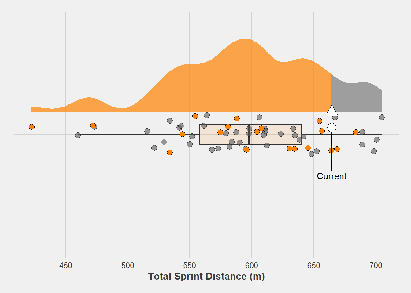
We could then plot both distributions side-by-side using the patchwork package.
p1 + p2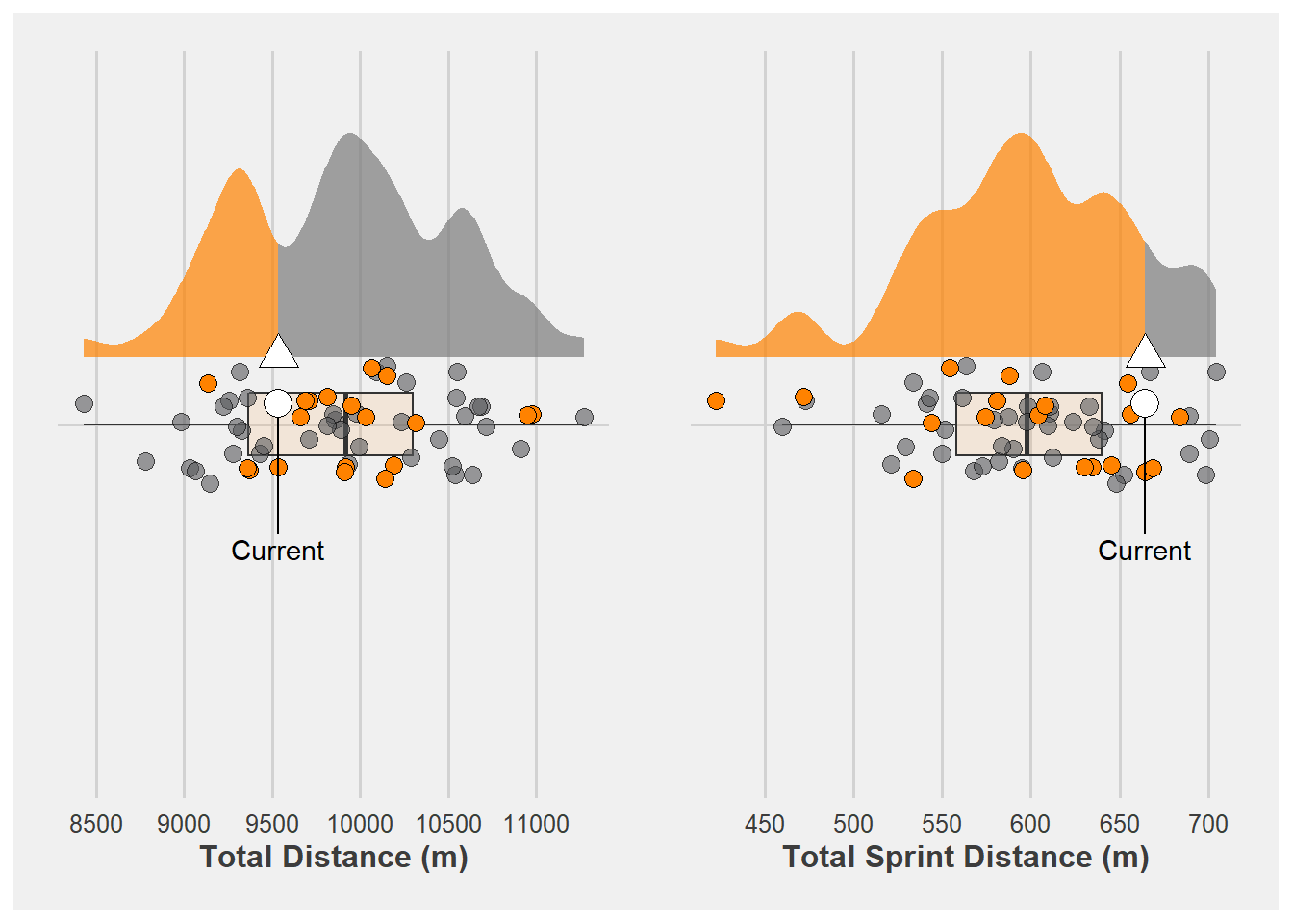
There you have it! This is just one way sports scientists may consider visualising their athlete GPS data to compare an athlete’s current match physical output versus what they typically do. Plotting data this way may facilitate communication between performance staff and inform training interventions based on what the athlete did. Although this is by no means the only plotting method to achieve this, hopefully this brief demonstration shows what we can do with the ggdist package in R and how it may be useful in sport.