Scaling and Plotting Athlete Test Battery Data
Visualise athlete STEN scores with circular and horizontal bar plots
This is the second installment of my visualising athlete data in R series covering a couple of different methods to plot test battery data. Its common for performance staff to have their athletes undergo a series of tests to assess different physical capacities important to their sport. This can help to identify the athlete’s strengths and areas that may require further development. For team-sports, it may also be useful to determine how individual athletes compare to their peers in a variety of tests, and one method to do this is by calculating STEN scores.
Test battery data is often collected in a variety of units, so its important to scale the results for more effective plotting. The steps below show how you can scale your athlete test battery data to reflect STEN scores and visualise them using circular and horizontal bar plots to allow for easy comparison across your athlete cohort.
Here are the packages for this tutorial. I’m loading plyr before tidyverse to avoid any conflicts with dplyr.
library(plyr)
library(tidyverse)
library(RColorBrewer)
Like some of my other posts, I’m again creating a mock dataset using a random number generator (rnorm) that represents scores from an example test battery for 15 athletes. The tests include countermovement jump (cmj_cm), reactive agility (rat_s), 10 (ten_s) and 40 m (forty_s) sprints, Nordic hamstring (nordic_n), isometric mid-thigh pull (imtp_n.kg), bench press (bench_kg) and Yo-Yo Intermittent Recovery Test Level 1 (yoyo). head() shows the first six rows of the data so you can see what it looks like.
set.seed(50)
test_dat <- data.frame(

  athlete = paste("Athlete", 1:15),
  cmj_cm = round(rnorm(15, mean = 30, sd = 5), 1),
  rat_s = round(rnorm(15, mean = 2.3, sd = 0.4), 1),
  ten_s =  round(rnorm(15, mean = 2, sd = 0.3), 1),
  forty_s = round(rnorm(15, mean = 5.4, sd = 0.3), 1),
  nordic_n = round(rnorm(15, mean = 400, sd = 30), 1),
  imtp_n.kg = round(rnorm(15, mean = 33, sd = 4), 1),
  bench_kg = round_any(rnorm(15, mean = 90, sd = 5), 2.5),
  yoyo = round(rnorm(15, mean = 18, sd = 1), 1)

)

test_dat %>% head()
## athlete cmj_cm rat_s ten_s forty_s nordic_n imtp_n.kg bench_kg yoyo
## 1 Athlete 1 32.7 2.2 2.1 5.5 409.5 29.9 97.5 18.0
## 2 Athlete 2 25.8 2.2 1.7 5.7 402.8 31.9 97.5 16.8
## 3 Athlete 3 30.2 2.0 1.7 4.9 401.1 36.8 92.5 19.4
## 4 Athlete 4 32.6 1.8 2.2 5.0 381.0 28.8 100.0 16.6
## 5 Athlete 5 21.4 2.2 1.7 5.3 357.0 34.7 90.0 15.5
## 6 Athlete 6 28.6 2.2 2.0 5.4 389.2 28.6 97.5 19.1This test battery data is in a raw format, but we need to convert these values to a z-score to then input into the STEN score calculation. A z-score is calculated as:

where x is the athlete’s raw score, μ is the mean of the squad and σ is the standard deviation of the squad. A z-score provides an indication of how far a particular data point is from the mean, where a z-score of 0 represents the raw score being identical to the mean. Applying the scale() function to the data calculates z-scores really easily. I’m using mutate_if() to apply scale() to only numeric columns.
z <- test_dat %>%
  mutate_if(is.numeric, scale) %>%
    mutate(across(where(is.numeric), round, 2))

z %>% head()
## athlete cmj_cm rat_s ten_s forty_s nordic_n imtp_n.kg bench_kg yoyo
## 1 Athlete 1 0.90 -0.26 0.45 0.70 0.85 -0.75 0.94 0.43
## 2 Athlete 2 -0.88 -0.26 -0.77 1.28 0.55 -0.21 0.94 -0.64
## 3 Athlete 3 0.25 -0.73 -0.77 -1.01 0.47 1.13 0.00 1.68
## 4 Athlete 4 0.87 -1.20 0.75 -0.72 -0.42 -1.05 1.40 -0.82
## 5 Athlete 5 -2.02 -0.26 -0.77 0.13 -1.48 0.56 -0.47 -1.80
## 6 Athlete 6 -0.16 -0.26 0.14 0.42 -0.05 -1.11 0.94 1.41We can now see how many standard deviations from the mean each athlete’s set of test scores are. The next step is to convert these z-scores to a STEN (Standard Tens) score - a score out of 10. Here’s how its calculated:

where z is the athlete’s z-score. A STEN score of <2 may be considered well below average, 5-7 average and >9 above average compared to the group. Given a 0-10 scale resonates for most people (closer to 10 being better), this may be a useful method for reporting athlete test data to coaches. mutate() coupled with across() applies the STEN calculation to each value (.) in all columns besides athlete. The second mutate() function reverses the scale for reactive agility, 10 and 40 m sprint tests given lower values reflect superior performance.
sten <- z %>%
  mutate(across(c(2:9), ~ . * 2 + 5.5)) %>%
  mutate(rat_s = 10 - rat_s,
         ten_s = 10 - ten_s,
         forty_s = 10 - forty_s) %>%
  mutate(across(where(is.numeric), round, 1))

sten %>% head()
## athlete cmj_cm rat_s ten_s forty_s nordic_n imtp_n.kg bench_kg yoyo
## 1 Athlete 1 7.3 5.0 3.6 3.1 7.2 4.0 7.4 6.4
## 2 Athlete 2 3.7 5.0 6.0 1.9 6.6 5.1 7.4 4.2
## 3 Athlete 3 6.0 6.0 6.0 6.5 6.4 7.8 5.5 8.9
## 4 Athlete 4 7.2 6.9 3.0 5.9 4.7 3.4 8.3 3.9
## 5 Athlete 5 1.5 5.0 6.0 4.2 2.5 6.6 4.6 1.9
## 6 Athlete 6 5.2 5.0 4.2 3.7 5.4 3.3 7.4 8.3Before I start plotting, I’m converting the data from wide format to long with pivot_longer() as we want to plot all tests as the x aesthetic in ggplot2. This will arrange the data so each measure is a sub entry under the column test. I’m also recoding the text strings for test so the names of each test are more presentable in a plot (this step is totally preferential depending on your level of OCD!).
sten_long <- sten %>%
  pivot_longer(!athlete, names_to = "test", values_to = "sten_score") %>%
  mutate(test = case_when(test == "cmj_cm" ~ "CMJ (cm)",
                          test == "rat_s" ~ "RAT (s)",
                          test == "ten_s" ~ "10 m Sprint (s)",
                          test == "forty_s" ~ "40 m Sprint (s)",
                          test == "nordic_n" ~ "Nordic (N)",
                          test == "imtp_n.kg" ~ "IMTP (N/kg)",
                          test == "bench_kg" ~ "Bench Press (kg)",
                          test == "yoyo" ~ "Yo-Yo IR1",
                          TRUE ~ as.character(test)))

sten_long %>% head(8)
## # A tibble: 8 x 3
## athlete test sten_score[,1]
## <chr> <chr> <dbl>
## 1 Athlete 1 CMJ (cm) 7.3
## 2 Athlete 1 RAT (s) 5
## 3 Athlete 1 10 m Sprint (s) 3.6
## 4 Athlete 1 40 m Sprint (s) 3.1
## 5 Athlete 1 Nordic (N) 7.2
## 6 Athlete 1 IMTP (N/kg) 4
## 7 Athlete 1 Bench Press (kg) 7.4
## 8 Athlete 1 Yo-Yo IR1 6.4Plotting
The data is now ready to plot! First, I’m going to create a circular bar plot that may be used as an alternative to a spider or radar chart. Next, I’ll show how we can easily make a horizontal bar plot to rank an athlete’s test outcomes.
Circular bar plot
I’m leaning on the work by Tobias Stalder to illustrate this circular bar plot example. Before I start compiling the plot, I’m creating a couple of variables to use as arguments in ggplot(). The first is a string to filter on a specific athlete (ath), while the second determines which test out of the eight listed has the lowest STEN score (sten_low). I’m simply using sten_low to inform where to include the scale labels inside the plot.
ath <- "Athlete 5"
sten_low <- sten_long %>%
  filter(athlete == ath) %>%
  filter(sten_score == min(sten_score))
Let’s run these first few lines of code. Here, I’m filtering sten_long based on the athlete we assigned to ath above, while the geom_hline() function - neatly explained by Tobias Stalder - creates custom grid lines at intervals of 2 (the reason for this step will be demonstrated further down). The bars are created with geom_col() which includes the use of str_wrap() to the x argument to wrap the test names over multiple lines. str_wrap(test, 7) seemed to format the current test labels the best. The lower limit (-3) in scale_y_continuous() expands the inner circle of the plot, while a custom fill is applied with scale_fill_stepsn(). For the fill, I’m using the YlGn palette from RColorBrewer to fill the bars based on the STEN score, with lower values represented by a lighter colour and higher values darker. coord_polar gives the circular appearance to the plot.
ggplot(sten_long %>% filter(athlete == ath)) +
  geom_hline(aes(yintercept = y), data.frame(y = c(0, 2, 4, 6, 8, 10)),
                 colour = "lightgrey") +
  geom_col(aes(x = str_wrap(test, 7), y = sten_score, fill = sten_score),
           alpha = 0.7, show.legend = TRUE) +
  scale_y_continuous(limits = c(-3, 11), breaks = seq(0, 10, 2)) +
  scale_fill_stepsn("STEN Score", colours = brewer.pal(name = "YlGn", n = 5),
                    limits = c(0, 10), breaks = 0:5 * 2) +
  geom_segment(aes(x = str_wrap(test, 7), y = 0, xend = str_wrap(test, 7),
                   yend = 11), linetype = "dashed", colour = "darkgrey") +
  coord_polar() +
  theme_minimal()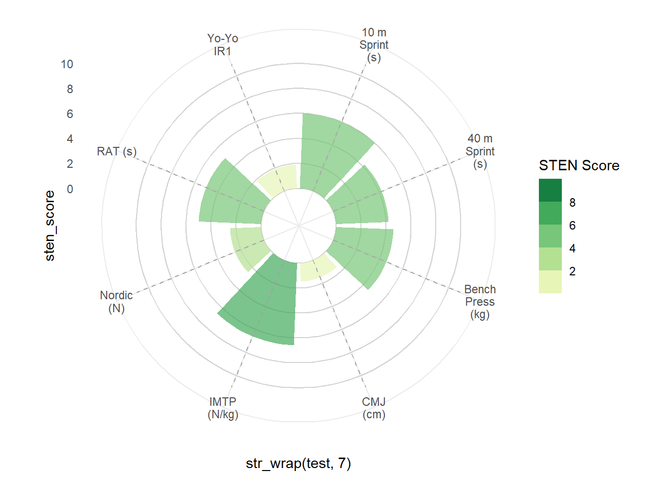
Next, I’m using five geom_text() arguments to insert custom scale labels inside the plot. Where possible, I want labels in as much white space as possible to aid readability, therefore I’m calling data = sten_low - created above - to tell geom_text() to position the labels over the lowest STEN score/bar. By using is.numeric(test) + 3.7, the labels are positioned slightly to the right of the segment line. You may need to play around with your own value depending on how many tests you have in your plot.
ggplot(sten_long %>% filter(athlete == ath)) +
  geom_hline(aes(yintercept = y), data.frame(y = c(0, 2, 4, 6, 8, 10)),
                 colour = "lightgrey") +
  geom_col(aes(x = str_wrap(test, 7), y = sten_score, fill = sten_score),
           alpha = 0.7, show.legend = TRUE) +
  scale_y_continuous(limits = c(-3, 11), breaks = seq(0, 10, 2)) +
  scale_fill_stepsn("STEN Score", colours = brewer.pal(name = "YlGn", n = 5),
                    limits = c(0, 10), breaks = 0:5 * 2) +
  geom_segment(aes(x = str_wrap(test, 7), y = 0, xend = str_wrap(test, 7),
                   yend = 11), linetype = "dashed", colour = "darkgrey") +
  coord_polar() +
  theme_minimal() +
  ### CHANGE IS HERE ###
  geom_text(data = sten_low, aes(x = is.numeric(test) + 3.7, y = 2.5),
            label = "2", size = 2.5) +
  geom_text(data = sten_low, aes(x = is.numeric(test) + 3.7, y = 4.5),
            label = "4", size = 2.5) +
  geom_text(data = sten_low, aes(x = is.numeric(test) + 3.7, y = 6.5),
            label = "6", size = 2.5) +
  geom_text(data = sten_low, aes(x = is.numeric(test) + 3.7, y = 8.5),
            label = "8", size = 2.5) +
  geom_text(data = sten_low, aes(x = is.numeric(test) + 3.7, y = 10.5),
            label = "10", size = 2.5)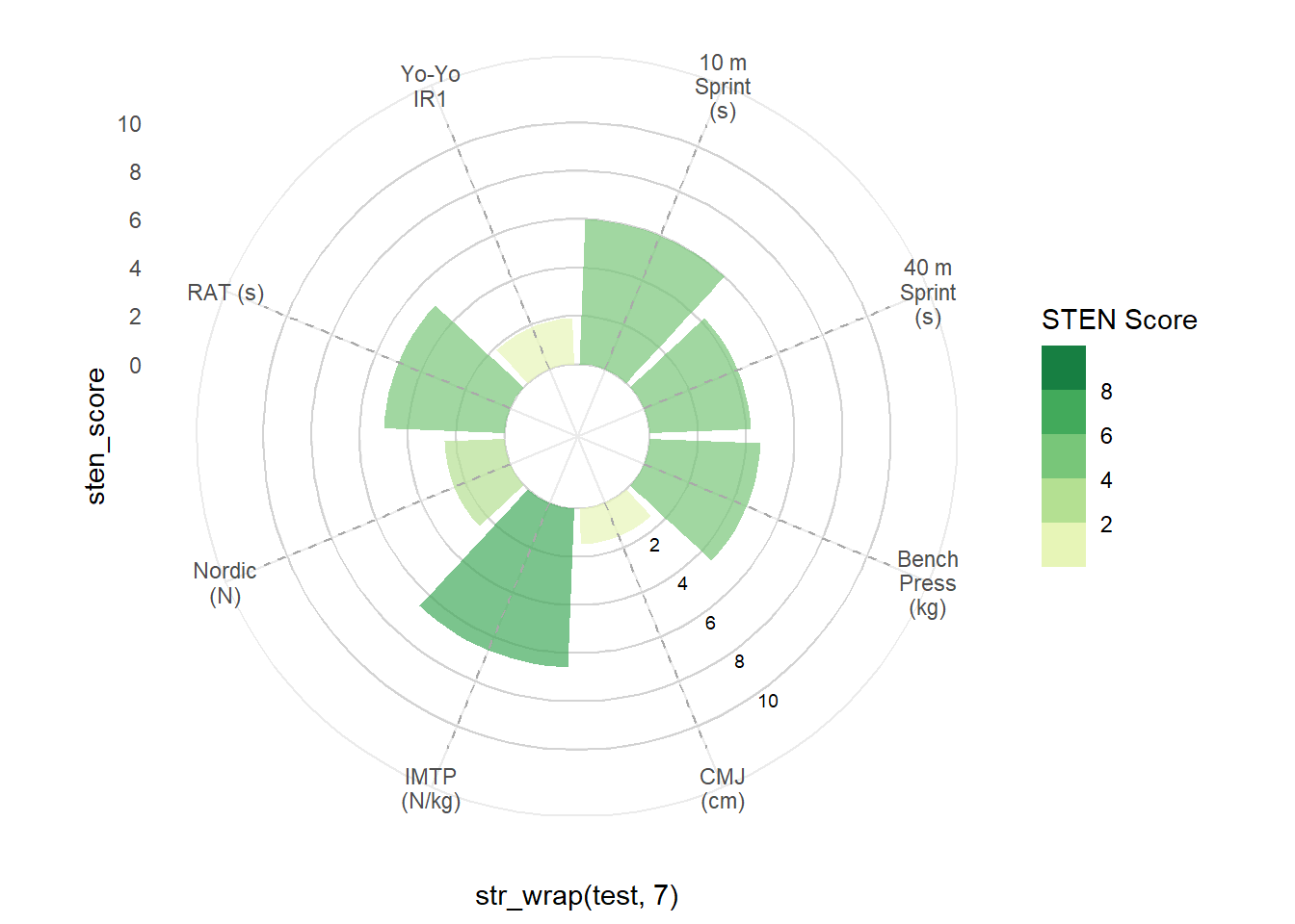
To finish the plot off, I’m editing the legend so its orientated horizontally and positioned above the chart. There’s also some theme edits to finalise the formatting of the plot, including panel.grid = element_blank() which removes the plot’s default grid lines so we’re left with our custom grid created with geom_hline. You’ll see that the test labels now appear to be sitting above the plot which looks a lot better!
ggplot(sten_long %>% filter(athlete == ath)) +
  geom_hline(aes(yintercept = y), data.frame(y = c(0, 2, 4, 6, 8, 10)),
                 colour = "lightgrey") +
  geom_col(aes(x = str_wrap(test, 7), y = sten_score, fill = sten_score),
           alpha = 0.7, show.legend = TRUE) +
  scale_y_continuous(limits = c(-3, 11), breaks = seq(0, 10, 2)) +
  scale_fill_stepsn("STEN Score", colours = brewer.pal(name = "YlGn", n = 5),
                    limits = c(0, 10), breaks = 0:5 * 2) +
  geom_segment(aes(x = str_wrap(test, 7), y = 0, xend = str_wrap(test, 7),
                   yend = 11), linetype = "dashed", colour = "darkgrey") +
  coord_polar() +
  theme_minimal() +
  geom_text(data = sten_low, aes(x = is.numeric(test) + 3.7, y = 2.5),
            label = "2", size = 2.5) +
  geom_text(data = sten_low, aes(x = is.numeric(test) + 3.7, y = 4.5),
            label = "4", size = 2.5) +
  geom_text(data = sten_low, aes(x = is.numeric(test) + 3.7, y = 6.5),
            label = "6", size = 2.5) +
  geom_text(data = sten_low, aes(x = is.numeric(test) + 3.7, y = 8.5),
            label = "8", size = 2.5) +
  geom_text(data = sten_low, aes(x = is.numeric(test) + 3.7, y = 10.5),
            label = "10", size = 2.5) +
  ### CHANGE IS HERE ###
  guides(fill = guide_colorsteps(barheight = 0.3, barwidth = 10,
                                 title.position = "top", title.hjust = 0.5)) +
  theme(panel.grid = element_blank(),
        axis.title = element_blank(),
        axis.text.x = element_text(face = "bold", size = 8),
        axis.text.y = element_blank(),
        legend.position = "top",
        legend.title = element_text(size = 6),
        legend.text = element_text(size = 6))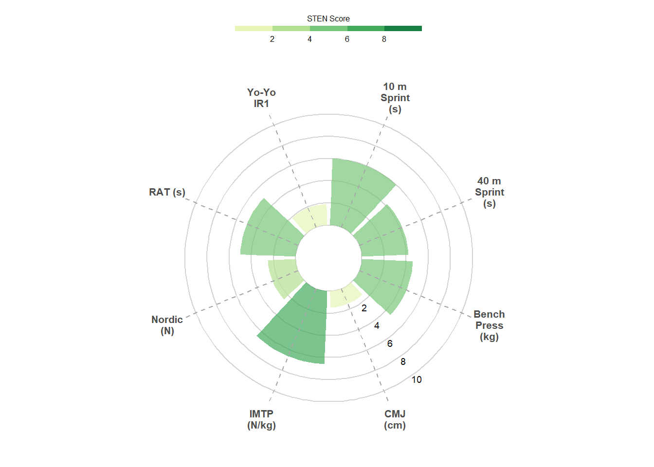
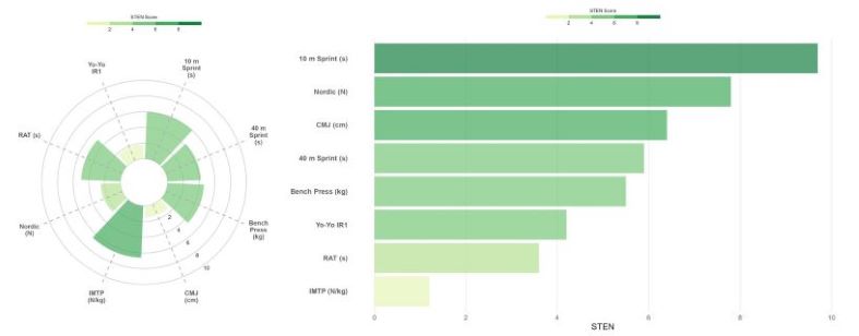
Now our circular bar plot is complete! We can see that this athlete has scored well below average, compared to the group, in the countermovement jump, but displays improved lower body strength with a higher ranking for the isometric mid-thigh pull (this is a pretend dataset, of course). Circular bar plots are a great alternative to perhaps the more familiar spider/radar chart. However, we can also very easily create a similar plot by flipping the bars horizontally.
Horizontal bar plot
Much of the code for the horizontal bar plot is similar to that for the circular bar chart, so the steps involved here aren’t broken up like the example above. I’m plotting a different athlete’s data here and using fct_reorder() from the forcats package (part of the tidyverse suite) to order the tests from the highest STEN score to lowest.
ath <- "Athlete 14"

ggplot(sten_long %>% filter(athlete == ath)) +
  geom_col(aes(x = fct_reorder(test, sten_score), y = sten_score, fill = sten_score), alpha = 0.7, show.legend = TRUE) +
  scale_y_continuous(limits = c(0, 10), breaks = seq(0, 10, 2)) +
  scale_fill_stepsn("STEN Score", colours = brewer.pal(name = "YlGn", n = 5),
                    limits = c(0, 10), breaks = 0:5 * 2) +
  coord_flip() +
  theme_minimal() +
  ylab("STEN") +
  guides(fill = guide_colorsteps(barheight = 0.3, barwidth = 10,
                                 title.position = "top", title.hjust = 0.5)) +
  theme(panel.grid.minor.x = element_blank(),
        panel.grid.major.y = element_blank(),
        axis.title.y = element_blank(),
        axis.text.y = element_text(face = "bold"),
        legend.position = "top",
        legend.title = element_text(size = 6),
        legend.text = element_text(size = 6))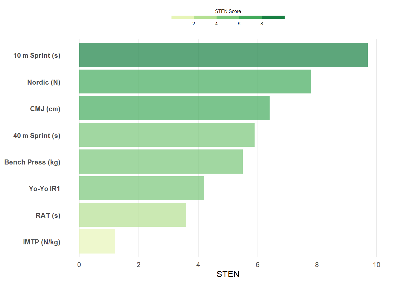
Ordering the bars from highest to lowest makes it really easy to identify which test the particular athlete performed best in relative to their peers, which in this case is the 10 m sprint, reflecting this athlete’s high acceleration ability. However, this plot also highlights that this athlete requires further development of their lower body strength, so a few extra sets of squats may be required in the gym!
So, there you have it! We’ve covered how to calculate z-scores and STEN scores to scale your athlete test battery data and used two simple and effective plotting techniques to visualise an athlete’s test rankings. Give these plots a try with your own (and proper) data and hopefully they add some value to your athlete monitoring workflow. There’s a lot more content coming out over the coming weeks and months, so make sure to follow me on Twitter to stay up to date with new tutorials and posts. Your support is greatly appreciated!